Subtitle Burning and Font Choices That Don’t Kill the Scene: Practical Fixes for Short-Drama Localization
Too many subtitle lines stacking up, covering faces or key props. A phrase that works in one language but lands flat—or worse, confusing—in another because the cultural weight got lost. And the same technical term or character title shifting spelling or tone halfway through a series. These problems show up constantly in short-drama work, especially vertical formats where the frame is already tight and viewers scroll with half an eye on the next episode.
Broadcasters and platforms have spent years refining the basics. BBC guidance notes that for landscape or square video, two lines remain the practical maximum; vertical (9:16) can stretch to three if nothing critical is covered. Netflix’s Timed Text Style Guide caps most Latin-script lines at around 42 characters and keeps adult reading speed near 17–20 characters per second. Go much higher and viewers miss the action while decoding text. Go denser and the picture disappears under type. The goal is not maximum information density; it is readable text that disappears into the experience.
When Lines Multiply and the Frame Disappears
Vertical short dramas amplify the risk. The safe area is narrower, faces sit closer to the bottom third, and platform UI often eats additional space. Three full lines of dense dialogue can obscure a character’s expression or a crucial prop. Industry practice favors shorter, tighter units timed to natural speech pauses rather than forcing every word onto the screen at once. Semantic breaks matter more than mechanical character counts: keep a single emotional beat together, split only at natural points, and never leave a lonely preposition or article hanging.
Font size needs to scale with resolution and viewing distance. A subtitle that looks fine on a desktop editor can swallow half a face on a phone. Guidelines commonly target text height between roughly 1/20 and 1/10 of frame height, with a practical floor near 44–50 px for 1080p content. Sans-serif faces with clear letterforms—Helvetica, Arial, or similar humanist options—hold up better under motion and compression than decorative or ultra-thin styles. A thin outline or semi-transparent box improves contrast without the heavy black bar that can itself become visual clutter. Pure white on pure black is reliable; pure black text on busy backgrounds is not. Drop shadows alone rarely solve legibility problems; they leave parts of each letter unprotected.
Positioning is not fixed. When lower-third graphics, titles, or a speaker’s mouth appear, the subtitle must move—usually raised or shifted—without jumping around every other cue. Rapid repositioning fatigues the eye. Consistency of placement, combined with controlled line count, keeps the viewer’s attention on the story rather than the mechanics of reading.
Cultural Knowledge Gaps That Break Immersion
Literal transfer of culture-loaded terms is one of the fastest ways to lose an audience. Concepts such as “face,” contract marriages, hierarchical address systems, or region-specific slang carry social logic that does not travel automatically. Research on micro-drama localization shows that unadapted cultural items frequently produce pragmatic misunderstanding or tonal mismatch. Native-speaking linguists who understand both the source conventions and the target audience’s expectations adjust intensity, register, and implication so the emotional force lands. A confrontational line that feels powerful in the original can read as melodrama or awkwardness elsewhere unless the emotional calibration is deliberate.
Short dramas compound the issue because episodes are short and production volume is high. A single series may run dozens or hundreds of episodes. Without early identification of recurring cultural anchors and a shared style guide, later episodes drift. The same holds for humor, family dynamics, and power relationships: what reads as understated tension in one market may need sharper expression in another. Platforms that succeed with localized short-form content treat adaptation as part of the creative process, not an after-the-fact language swap.
Terminology That Shifts Mid-Story
Inconsistency in names, titles, technical terms, or recurring motifs is especially damaging across long series. Viewers notice when a character’s rank or a key object changes spelling or phrasing between episodes 12 and 37. Professional workflows maintain centralized term bases and character sheets from the first script analysis onward. Translators work from the same reference materials; reviewers check continuity as rigorously as accuracy. Machine output without human term control and post-editing tends to introduce exactly these variations, particularly with dialectal expressions or specialized vocabulary.
Reading-speed constraints interact with expansion or compression. Some languages run longer than the source; others pack denser. The timing template should stay fixed to the audio and picture, so the translation is condensed or expanded to fit the available window rather than the reverse. Tools that preserve ASS styling or other rich formats help keep fonts, colors, and positioning intact instead of stripping everything to plain text.
What Holds Up Under Real Viewing Conditions
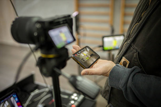
Test on actual devices in the target orientation. Desktop previews hide problems that appear immediately on a phone held in one hand. Check contrast against both light and dark scenes. Confirm that no important visual information—faces, text already on screen, critical action—is covered. Keep average reading speed comfortable for the intended audience; children’s content and complex adult dialogue both need slower rates than fast-paced banter.
These constraints are not arbitrary. They exist because subtitles compete with the picture for attention and because viewers read on-screen text more slowly than print. When the balance is right, the text supports the story instead of competing with it. When it is wrong, retention drops and comments fill with complaints about unreadable or culturally tone-deaf lines.
Artlangs Translation has spent more than two decades refining exactly these processes across video localization, short-drama subtitle work, game localization, multilingual audiobook dubbing, and large-scale data annotation and transcription. The company works with more than 20,000 professional linguists and covers 230-plus languages, delivering projects that keep terminology consistent, cultural nuance intact, and visual presentation clean enough that the subtitles serve the drama rather than obscure it.